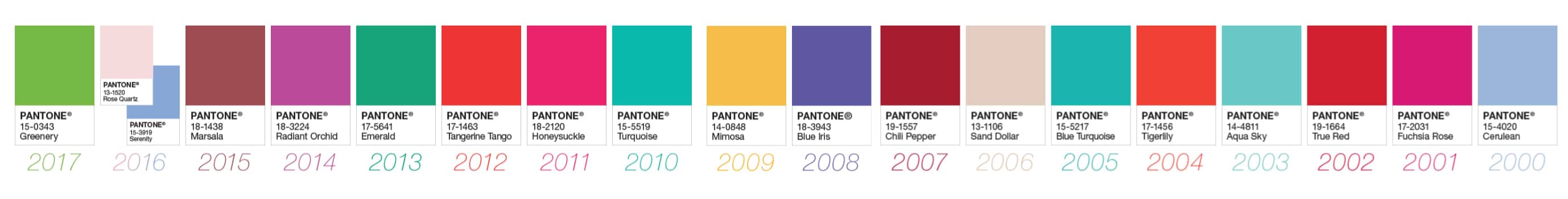

Pantone has officially announced their color of the year, 18-3838 Ultra Violet, it is a vibrant and useful purple that we have seen a lot in the past year swirled into the popular “unicorn” pallet that was put on EVERYTHING in 2017 (and I mean everything, unicorn bagels? What does that even mean?) But in the new year we can expect this color to come into its’ own and be a lot more visible. I personally love it because of what a useful color it is, purple communicates power and strength and here we have a purple that does this job but doesn’t feel as overbearing as say, a deep plum might. It’s a welcoming and jovial tone is what I’m trying to say.
For 18 years, the Pantone color institute, creators of the Pantone matching system for colors (their business is organizing colors, but with science, how cool is that?) have been naming a color of the year, and a lot goes into it. Who would’ve thought that picking the color of the year would involve a collection of representatives from other nations color standards groups gathering for four days of discussion and debate? To be honest, who thought that there was such a thing as a national color standard group? What do you think they do when they aren’t helping pick the next hottest color?

Reportedly the color of the year is meant to connect to the current zeitgeist of its time, sometimes going with it and sometimes challenging it in hopes of looking towards something better. In 2018 the color of the year page opens up with these words about Ultra Violet
“A dramatically provocative and thoughtful purple shade, PANTONE 18-3838 Ultra Violet communicates originality, ingenuity, and visionary thinking that points us toward the future.”
And I have to say I think they’re right, this shade is a power purple that is versatile and applicable to many different types of businesses. A website header in this color, ultra violet tee’s, pamphlets with a gorgeous background, it’s all up for grabs and that’s what amazing and awesome about Pantone. Their choices the past 18 years have, without fail, have been spot on and fit the tone of the year shocking well, though, they are the experts on color, so it can be only be expected that they know how to pick them.
It’s critical for business owners of all types to pay attention to the color of the year and find ways to employ it that are valuable and enriching to their brand. Not every business will be able to use 18-3838 Ultra Violet in the same way, but they can all find a way to employ it. The color of the year becomes widespread so much quicker than many of us notice, in fact, so many people don’t even really know the true purpose of Pantone as a company and simply think a color is “the color” because it is. There is so much going on behind the scenes to curate how we experience our everyday lives, and if you are in on some of that trend creation and follow it from the start, you can be ahead of the curve on picking up what popular, like this particular shade of purple.

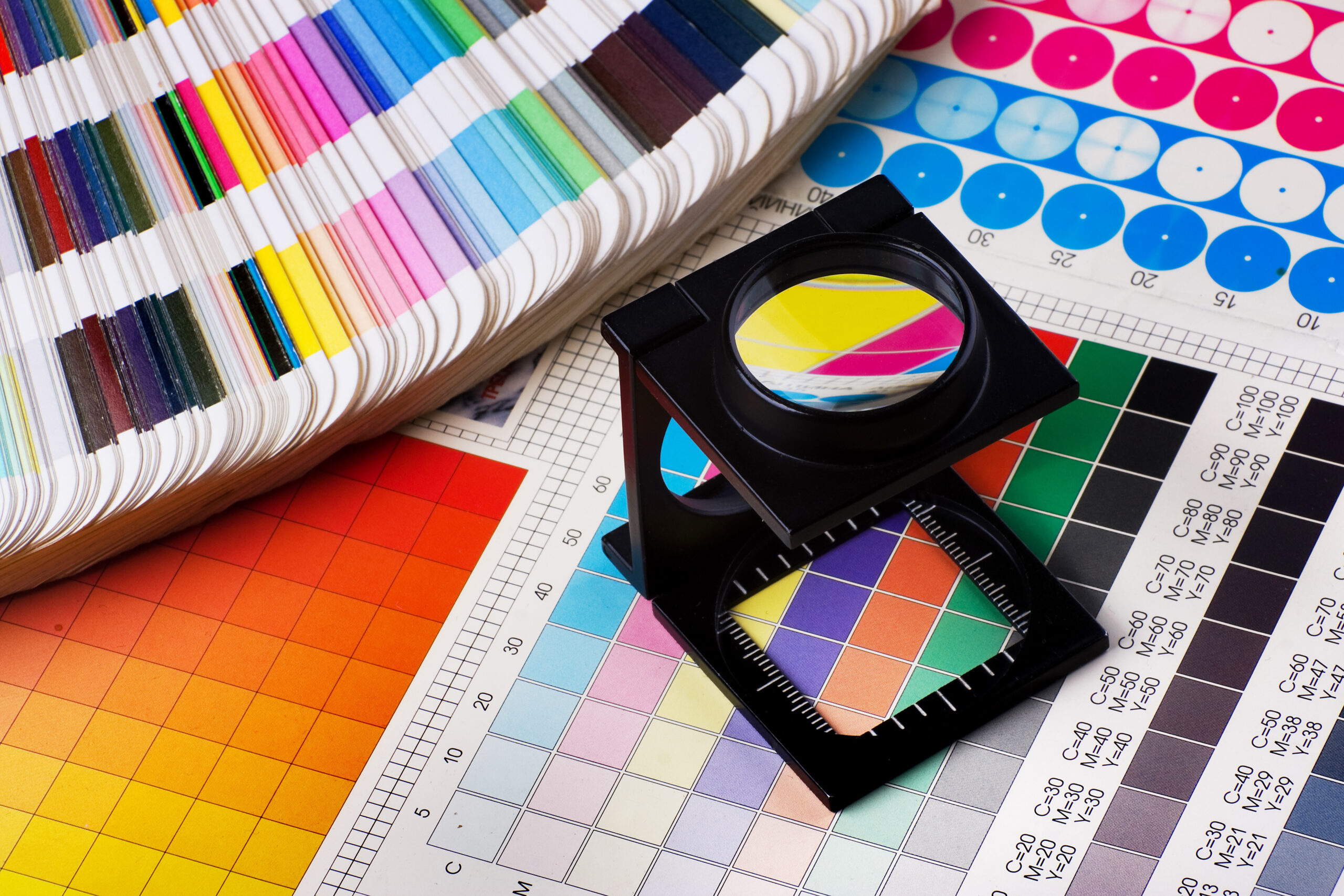
Pantone offers plastic, coated card, and uncoated card options for color chips, which all sorts of consumer based businesses such as florists and event planners purchase to use for print and product reference. Each year their color gets the star treatment with releases of special books of color chips (with included history and chips of past colors colors of the year included,) and a page on the Pantone website chock full of links to all sorts of items made in the official ultra violet, and there are a lot of them. If your business makes the choice to be on top of the color of the year, they are making the choice to be more on trend and visible in the year to come.